Thoughts on Using Tachyons for Rescale.com’s Redesign

A little more than a month ago we shipped a redesigned version of our homepage, https://rescale.com. During its development, we thought it would be a good time to reevaluate the way we were writing our CSS.
At the time, our main CSS file was more than 2000 lines long, written in the classic semantic-class-names style (e.g. the news section gets the .news class) with a couple of utility classes here and there.
From skimming our CSS code, we felt a little uneasy going into this redesign because 1) many of the CSS classes we had written were probably not reusable in the new design, so we were going to end up adding a lot more CSS, and 2) there were going to be a lot more responsive components, and the way we were writing responsive CSS was difficult to follow and change.
One of the major pain points with our old CSS was that it was very hard to visualize how an element with a particular CSS class would behave on different screen sizes just from reading the source code. This arose because our media-query sections were separated by hundreds of lines of CSS. For example, with this CSS:
.footer  {
  color: #999;
  display: block;
  float: left;
  line-height: 20px;
  padding: 0 0 0 5px;
  text-align: left;
  width: 120px;
}
/* hundreds of lines later */
@media only screen and (min-width: 768px) {
  /* hundreds of lines later */
  .footer {
    padding: 0 0 0 30px;
    width: 15%;
  }
}
/* hundreds of lines later */
@media only screen and (min-width: 1024px) {
  /* hundreds of lines later */
  .footer {
    padding: 0 0 0 40px;
  }
}
If we were reading the .footer class under one of the media queries, it would be very difficult to remember what was in the base class, what base properties were being overridden, and which media query block we were even in. Adding more classes would only exacerbate the problem.
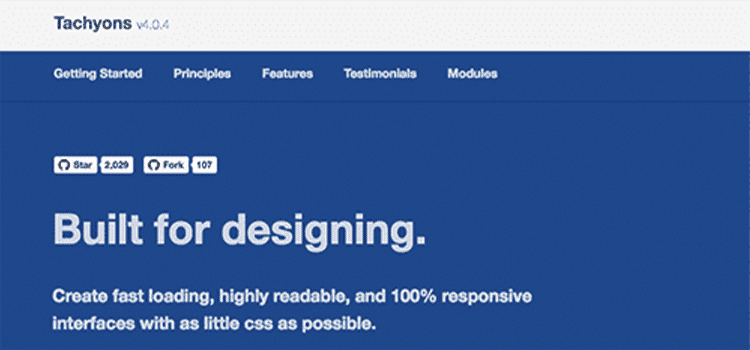
Around that time we stumbled across the Tachyons CSS library and an article written by its creator, Adam Morse, titled CSS and Scalability.
In it, Adam argues that the crux of CSS scalability and reusability problems is the use of semantic class name, and with such a system, we will never stop writing CSS.
Here are some of the most intriguing points made in that article:
- If you’re going to build a new component, or change a piece of UI in your app – what do you do? I don’t know anyone that reads all the available CSS in the app to see if there is something they can reuse.
- If you are starting from the assumption that your CSS isn’t reusable, your first instinct is to write new CSS. But most likely you aren’t creating a new classification of visual styles. In my experience it is likely that you are replicating visual styles that already exist.
- In this model, you will never stop writing CSS. Refactoring CSS is hard and time consuming. Deleting unused CSS is hard and time consuming. And more often than not – it’s not work people are excited to do. So what happens? People keep writing more and more CSS.
With that, we adopted the Tachyons library and were amazed by how little CSS we had to write in order to implement our redesign, and that implementing responsive designs was fun again.
Tachyons come with a bunch of CSS classes, each of which contains only one property. For example, .fl defines float: left. Furthermore, for each class there are classes with responsive modifiers. For example. .fl-ns means only apply float: left when the screen size is “not small”, or above 480px.
We use these classes as building blocks for components. For example, here’s one column of a responsive 4 column layout:
That says, float left and take up 50% of the width when the screen is bigger than “not small”, and take up 25% of the width when the screen is bigger than “medium”. If it’s smaller than “not small”, then use the default behavior of a div, which is to take up 100% of the width.
The other thing Tachyons buys us is a set of predefined font sizes and padding/margin spacings also known as font and spacing scales. This system has some pros and cons.
One of the biggest pros is that we spend a lot less time deciding on sizes. For example, prior to adopting Tachyons, we would often ask ourselves if a particular section should use a font size of 16px or 18px, or should the padding be 8px or 10px. Tachyons reduce the number of decisions while increasing consistency.
The con is, of course, when we want to use size, not on these scales. The way we handle this is just to inline the style because usually, they’re not going to be reused anyways so there’s no reason these one-off styles should be in CSS.
The other problem is there will be a repetition of elements with the same classes, usually among sibling elements. For the 4 column component above, we would have repeated it 4 times. This is a minor issue for code editors with multiple cursors. If it becomes a problem we can use a template system for abstract away the components.
Overall, we think this is the right direction that CSS systems for scalability are heading. In other words, the best way to scale CSS is to stop writing CSS.