
Which One to Worry About? Ebola vs. Influenza

Lately, news from West Africa is almost always on Ebola. This is not a new problem, however, this historical Ebola epidemic continues to have a significant impact in the region. At the very least, you will see what looks like a tree with sparkling lights (see the videos below). In actuality, the following is an ab initio model of the disease spreading in a hypothetical network. This is not a blog about how Ebola will take over the world, but perhaps it will hopefully give you an insight as to why it will not.
Model
The limited locality and the number of cases reported makes Ebola a disease requiring estimates that likely do not reflect reality. With limited information available we take a direct approach by simulating the person-to-person and person-to-public interaction. The model consists of five stages.
The stages of Ebola are: not exposed, infected, contagious, undercare, and deceased or recovered. Everyone except patient(s) zero is initially not exposed to the virus. The original patient(s) progress through the stages and eventually become contagious. We simulate a case where 5 people randomly selected are infected. The incubation period is normally distributed with a mean of 19 days. Followed by 3 days of the contagious period and finally 10 days of medical care. These two periods are both normally distributed about their respective means.
There are two infection paths. The first is the relationships between those we know. The second is through the public space. A person can only become infected through both of these paths and when they interact with a person who is contagious. A person who is contagious eventually becomes too sick and goes under medical quarantine. At this point, the patient is isolated from society. We also assume that the number of medical staff who become infected is insignificant.
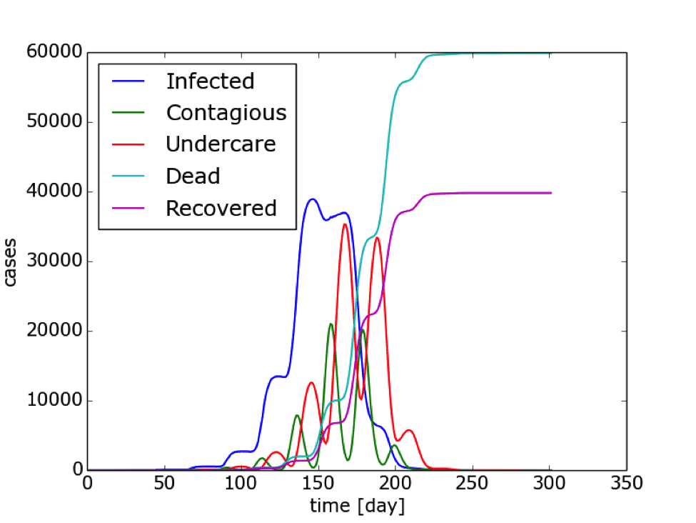
Beyond the simplifications described, there are no control measures to counter the spread of Ebola except the quarantine imposed on the sick. The parameters used are at best, estimates, and likely do not reflect reality. We set the probability of infection by interacting with a contagious person at 50% and the infection by interacting in public at 1%. The probability of death is 60%. Below is a video of this simulation with 100,000 people in a hypothetical network for 300 days. The stages are colored, with white representing a healthy person, yellow is infected, red is contagious, orange is quarantined, black represents death and blue represents recovery.
It is apparent from the video that the propagation of waves originates from the major cluster in the network. We can see these manifested in the figure below. Without the video above, the oscillation in the figure below can be difficult to understand. This was a simple model, but it should be clear that quarantine is a crucial and an effective measure against the spread the virus. Below in Graph 1 is of the simulated model representing the cases that became infected.
Influenza vs. Ebola
Arguably, what should concern most of us is not Ebola but the seasonal flu. Several millions become severely ill of which a quarter to a half million people die from the Influenza virus annually. Unlike Ebola with a high fatality, the seasonal flu is significantly less fatal but more infectious.
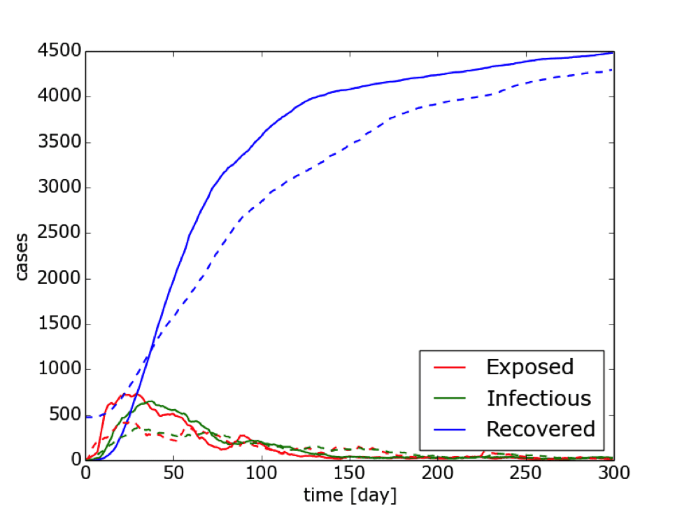
We can simulate the spread of the flu using a simple SEIR model. It is often described by a series of equations. We can choose to solve this nonlinear system of ordinary differential equations (ODEs) and obtain a solution for the entire population sample. However, we would like to see the actual propagation of the wave of infection throughout the population. We will take a similar modeling approach as Ebola. Shown below in Figure 1, is the network representing 5,000 people and their relationships.

If some have immunity, what is the impact on the population? We simulate the exact same case except 10% of the population have immunity. Figure 2 is the same network except with the cyan colored nodes representing those with immunity.

Graph 2 below, compares the two simulations. The solid lines are the number of cases for the first simulation and the dotted lines are the number of cases for the second simulation. The rate of infection is mitigated for the case where, initially, some people were immune. The financial cost to the population can be inferred by the area under the curve. It goes without saying, this inference also applies to Ebola and corresponds with the severe impact it can have on developing economies.
After an analytical look at both Ebola and Influenza, hopefully, it is a little clearer where you should spend your worrying energy.